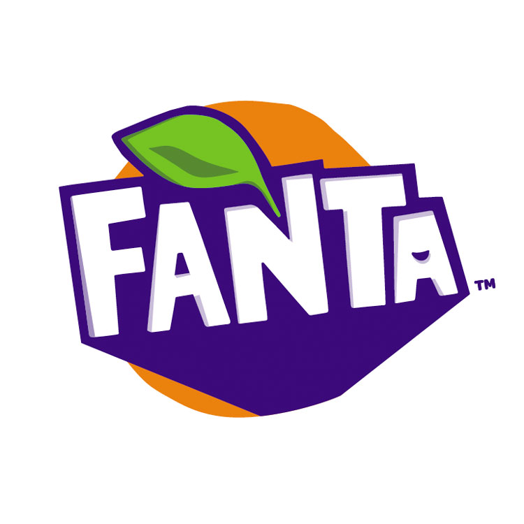
The soft drinks brand has swapped out its rounded logotype for an angular one, which aims to be more “fun” and “vibrant”.
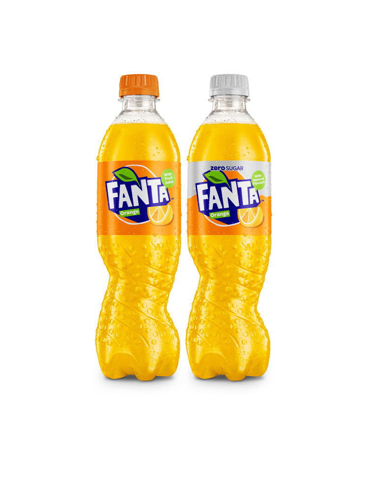
 Fanta has been rebranded in the UK, taking on a new, angular logo with a brighter colour palette, and will appear on shelf in a redesigned twisted bottle.

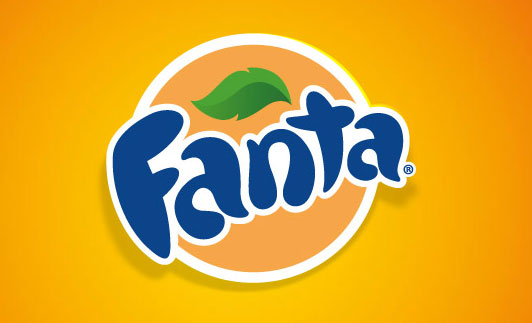
The new visual identity, which aims to be “fun” and “vibrant” according to Fanta, is based on a hand-cut pattern that has been digitised. It swaps out a rounded sans-serif typeface, for an angular one, and inverts the colours so that the logotype is now white and the background is blue.
The circular border and leaf emblem remains, but brighter shades of blue, orange and green have been used. There is also now an orange slice emblem, and the word “orange” is more prominent, forming part of the main logo lock-up in a white typeface with a green background. The term “Made with fruit” has also been added to the logo.
 The rebrand is accompanied by a new bottle, with the symmetrical design being swapped out for an irregular, spiral shape which aims to be “unique” and “eye-catching”, says Fanta.
Studio Koto has designed the new branding, while consultancy Drinkworks has redesigned the bottle. Drinkworks claims it is the “world’s first asymmetric bottle for a carbonated soft drink” and says it “embodies the brand’s playfulness”.
The design refresh sits alongside a marketing campaign, and a new Fanta recipe which claims to have a third less sugar than previously.
Fanta is owned by the Coca-Cola Company and is the company’s second oldest brand, founded in 1940.
The new visual identity has already rolled out in Eastern Europe, and will roll out in stores in the UK from April.
Article Source: designweek.co.uk

